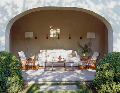
I love Sabrina Linn's penthouse...so charming and colorful...


found via

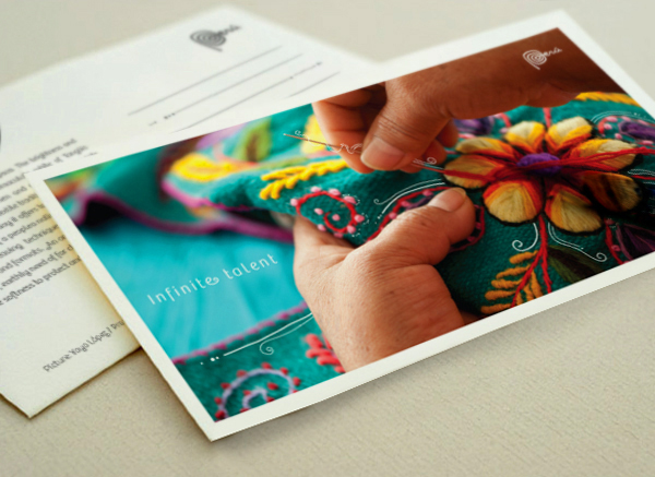
It is amazingly refreshing to see a logo that does not rely on a sans serif and an isolated icon — nothing wrong with that model, but we’ve seen so much of it lately that it’s easy to forget there are other ways of doing things. The spiral shape immediately conjures up associations with a visual culture full of joyful, complex patterns that are evident everywhere from ancient sites to the way the Incan people dress. It’s playful, lively, memorable and unique. It flows perfectly into the script handwriting which feels effortless and organic. I don’t think it’s the most beautiful logo per se, but it is beautifully appropriate.

When graphic designers Roy and Liane Burns set out to buy their first house, they sought modern, affordable, and sustainable living. After an unavailing search, they met co-founders Matthew Finley (of Matthew & Mikel’s DIY Water+Works Remodel) and Will Brothers from the design-build practice Green Bottle Workshop. Over coffee and rice krispies treats, a GBW fav, Roy and Liane became convinced that their budget need not prevent them from building their dream home.

 |
| I love the bright yellow stools against the white kitchen. |
 |
| I think this little Nursery for their son Walt is adorable, I love the Eames rocker. |


 |
| This one reminds me of some of my china. |